

Sharing with others
Anyone that visits our site should be able to use our pieces in their sites, with full quality, without needing to ask us and without needing to purchase specific software or services. They should also be allowed to translate or adapt them, if they want to contextualise, without require them to buy services or software and without unwanted freeware advertising in their pages.
Just like in our site, the media pieces have to be available for many years, display well in all devices and be interactive (if their sites allow this type of external content - [example]). Finally our pieces can't capture user data, for example by setting cookies or having Analytics, as this might violate the GDPR of the sites that use them.
Some sites have tight deadlines and adding uncertainty and delays is not helpful for them. Contacting us should be an option, not a requirement when using our materials.
See also the Spanish office Open Data Protocol (ES), and the presentation to the office of our Thinking Lab presentation (ES). Both documents contain collaboration and transparency requirements also followed in this guide.
▸ Information about how to use our materials
All our materials should have an infobox, with instructions on how to use the piece in other sites. Curently the infobox shows when the user clicks the download link in the footer of each piece.
▸ Download infobox
If we explain to our users how to do it, our materials will be shared and reused. The Spanish Office will test adding infoboxes linked from the footer of all charts, maps and infographics.
Examples:
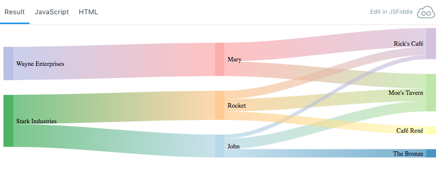
Modal template Download infograph
Easily create infoboxes
Creating infoboxes in our site is very easy, as we have a Wordpress plugin to do it.
- Click "Add Post element".
- Click "Infobox".
- Fill the form following the instructions. There's 3 infobox types: map, chart and infographic.
- Click "Insert element".
- Test if the infobox is working before publishing the page.
▸ Notes about each format
Bellow some notes and recommendations on how to share visualisations in different formats and some challenges posed by each format.
▸ 1. Static images
In the past we have shared infographics and charts as static images, but this static images:
- Are not interactive and in many cases the lack of interactivity harms the user experience. Often there's information missing or too much information in the screen at once.
- Aren’t adaptable to different screen sizes. At best the text and vector elements will be blurred, but often the user can't read the text in the piece because it's too small in certain devices.
Please note that it is possible to use static images properly in a responsive manner, specially if different versions of images are created for a specific site but often this is not properly implemented. - Are harder to change, and some sites may not like them as much as they might not comply with their graphic design rules. This issue can be minimised by giving them access to vectorial editable formats like .svg and .ai (Adobe Illustrator).
This image was shared in a press area by the Ocean Cleanup Foundation. As you can notice, both text and graphics are blurred and in mobile it's barely readable. We couldn't access the raw vectorial images, and there wasn't other bitmap versions of the same piece. There was little we could do in this case. Other images in the same media package are even worse.
It’s possible to make graphics with static images that adjust to the user screen size but you need specific image sizes and specific html code for each site. It’s not feasible that we create this images as it’s time consuming and we don’t have access to the site’s backend to test.
Our site is visited by large percentages of users with screen sizes between 320 x 450 and 1920 x 1080 and some of this users will have screens with higher pixel density. It’s fundamental that all users can see the graphics as good as possible. The page about infographics size informs about image sizes for our website and magazine and the formats we should use. If we follow it’s recommendations we can publish high quality infographics.
If we want to publish an infographic in Facebook or Twitter we need to create an image optimised for this social networks. This image will likely be less informative as it’s main goal is to stand out and invite the user to click. As of August 2018, we've obtained decent results with 491 x 506 sized images for Twitter and 500 x 516 for Facebook.
▸ 2. Videos
Technically videos, specially Youtube videos, work well in all websites and most social networks. While some sites block some types of external content, they generally allow posting simple videos in Youtube.
Html5 videos (not hosted in Youtube) are also well supported. Video-based interactives, using Youtube or not, are not that well supported: they have the same limitations as the charts.
Ideally some videos shoud have a mobile (small screen size) version and a large version as some graphics can't be understood if the screen is too small. More information
▸ 3. Iframes or packed javascript?
With this two techniques we are sharing, with other sites, fully interactive and responsive pieces, just like they appear in our website.
Main technique - Packed HTML + Javascript
Website editors can easily insert our charts and infographics in their websites and the piece will adjust automatically to the site's layout. To add an infographic you just need to add a code like:
                    <div id="infoContainer" style="width: 100%;"></div>

                    <script src="https://storage.googleapis.com/gpes-static/pozos/pozos.min.js" type="application/javascript" defer></script>
Since version 2 of this guide, we've carefully coded the scripts to minimise interferences with the site’s functionality, but it’s very hard to predict that it works without problems everywhere.
Just like the alternative iframes technique (or even more), not all sites will support it. For the same reasons content farms like Wordpress.com and Medium prevent users from adding Javascript. At the moment we are testing it with infographics and:
- It works in Our site (Wordpress Classic), Greenwire, our magazine, Planet 3, Planet 4, Blogger, Other WP (Wordpress Guttenberg)...
- It doesn't work in Wordpress.com, Medium...
Alternative: Iframes to embedded in the site
With this technique we insert the graphic in the page by using an iframe. Websites can add the piece to their site just like a Youtube video.
Simple iframes aren’t a good solution to insert many content types in responsive pages. They work well for videos and other fixed-ratio content, but tend to cause problems with content that doesn’t has a fixed ratio.
More information in the page inserting an iframe in a page.
Some popular content farms forbid the use of iframed content. For example Wordpress does not allow the use of iframes in blogs hosted in Wordpress.com, but you can use them in your own Wordpress install. Iframes work in Blogger but don't work in Medium.
▸ 4. Share the (editable) code
With this technique we share the code and data to reproduce the piece in another site. We do it using tools and techniques that make it easy for a beginner web developer to copy and adjust the code to their site. With this technique each site can easily adjust the fonts, colors and other design elements so that the graph integrates with their pages.
IMPORTANT: This is also the best way to share pieces to translate and adjust by other Greenpeace offices. Offices will be able to translate, localise, adjust or remix as they want.
There’s many tools that help sharing the code and make it easier to translate, localise, adjust and remix. We have chosen:
Simple tool - Jsfiddle
Jsfiddle is easier to use and with an important feature that’s very helpful when developing or translating: version control. Version control is fundamental to experiment and be able to go back to previously saved versions. Besides in Jsfiddle the pieces are not public until you want them to be.
To better use this tool each user should create it’s own free account and use it to clone, modify and share it’s own graphics. We are already using Jsfiddle.
Advanced Tool - Github
Github is the most popular site to share code, collaborate and version control. Github is also used by many data journalists, analysts and data scientists. Some examples of data journalism related accounts: Guardian, Washington Post, Five Thirty Eight, NY Times and Civio (Spanish). See also the Github's collection on open journalism...
In Greenpeace we use Github globally with a shared account with more than 150 repositories from a few NROs. 25 of those repositories are maintained by the Spanish Office. There's also a Github team for the Spanish Office with Osvaldo, Olga and Raul. Our 3 permanent translators are in Github as well (Paula, Ixone and Alicia) and have used it to translate a few Greenpeace projects.
We are starting to use Github to:
- Translate interactive apps
- Develop charts and maps
- Store data and collaborate analysing it.
In the future, we'll also use it to:
- Share raw data and colaborate in open investigations.
- Share and collaborate in interactive data visualisation projects.
▸ 5. Share data in a standard format
With this technique we share the data in a standard plug-n-play format, and it’s up to the site to decide the tool used to show it to their users. It’s what we do with videos: we send them .mp4 files and it’s up to each site to decide on how they want to present it.
The main problem is that there aren’t any plug-n-play standard data formats. With maps there’s GeoJson and KML but not for other data types. Another problem is that often we add functionality to our maps that needs more than just GeoJson or KML.
For example, we use KML for the map in our contact page and GeoJson for the map in Las rutas de riesgo de las armas españolas.
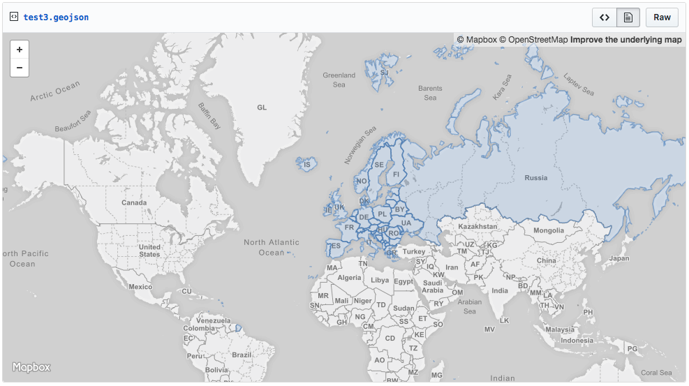 GeoJson file in Gist
▸ 6. Share also raw data (open data)
For certain specific audiences it’s very important to share the raw data (if confirmed and if the data license allows it) used to prepare the data used in the graphic. With access to the raw data other people can study it with another perspective and make alternative visualisations. It’s also a way to be transparent and open to scrutiny. Generally it will add credibility to our findings.
In certain pages we should add a preview of the data, links to the files in one or more formats and information about authors and license.
When we share raw data we should make an effort to make it understandable by others and facilitate downloads in open formats.
To host and preview raw data in our websites we have chosen Google Drive with Team Drives. It’s a system that we already use, and although it’s not open source, it allows exporting data to many open formats. Google Drive is easy to use and to update the data.
Download CSV, open document or doc excel. Author: XXX, license: YYY.
▸ 7. Special format for e-learning. SCORM
All the materials in this guide can be used in e-learning courses and one of the standards to pack e-learning contents is SCORM. This format is supported by the vast majority of the e-learning software currently available.
SCORM is basically html, css and javascript packed in a certain way so that e-learning software (LMS), like for example, Moodle, can communicate with the content. This basic communication allows the LMS to track the student’s behaviour inside the SCORM package and create exams with questions and scores.
To convert your HTML5 app to SCORM, you can check the examples in gpes-html5-scorm-presentation and gpes-activism-school-elearning-template. Make sure your HTML5 app is responsive and always test everything.
▸ Use of commercial products
Charts produced with commercial products like Tableau have their advantages and disadvantages, with differences from brand to brand. There’s dozens of services and it’s hard to make comments that apply to all of them but generally:
- The site that receives the chart from us must create an account on the same service, if it wants to translate or adapt the chart. Maybe at first of for small amounts of traffic it’s free, but it’s likely that they have to switch to a paid account. And paid accounts need to be maintained: invoices, permission levels, user accounts, who can have access to the backend… What happens often is that it’s a lot of hassle to maintain this accounts in the long term.
- Most if not all sites do not facilitate the transfer of charts/maps between accounts. That implies that to have an editable copy of the original chart they have to recreate it from the available data, definitely a time consuming task.
- Professional and flexible products aren’t easy to use and must be learned. They need to spend a lot of time learning the basics of the product just to make a small adjustment.
- Even if they don’t want to change or translate the graphic, some sites might not want to have in their pages content that’s not on their own accounts. Maybe there’s an internal policy against that or they fear that the graphic is changed or deleted latter.
Yes, some sites use commercial products, but their needs, skills and organisational structure are different from our own. Their products are slightly easier to start with but harder to progress.
And for us it would mean keep paying for services that we don't use anymore, just to maintain the charts online.
▸ Conclusion
Before starting to produce materials to share please create a small team and define, as soon as possible, with who do you want to share it with, usage and type of chart, infographic or map. This scope should be taken into account since the beginning.